There is a great deal of interest in the growth of FT8 (and in particular, whether other modes are losing out to it), but the analysis of the raw data up to now has been dependent on whether I have the time to run the reports. It is reasonably hard to get a visually clean and uncluttered report, due to the significant daily and monthly variations in activity, such as weekends and mode-specific contests and the amount of fussing over the data set needed to make legible graphs.
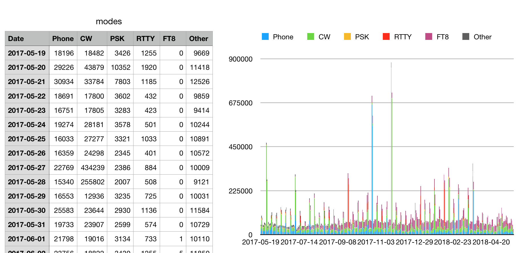
After looking at this a few times, I realised the best thing to do is to make the raw data available on a regular basis, in the hope that someone with the tools and the time to spare will make some new and interesting reports that will satisfy everyone’s curiosity! Here is the data:
- It is updated monthly (around the 10th of the month).
- Every day for the last 15 years has a row in the data, which makes it quite a large data set. f you load the whole data set into Excel and ask it to create a chart, it will crash (although Apple’s Numbers app does ok). You need to be a bit selective, and only include the data you really want to study, or be prepared for a lot of frustration!
- I would suggest trimming off two or three months, as the most recent uploads are not always a balanced report. Some users upload infrequently, so allow more time for their uploads to be received and processed. Other than that, I think the key to any clean reporting will be the type of smoothing function used. I’d be interested to hear from anyone who produces a useful graph (and will include your graphs here, if you wish).
- I would appreciate it if you could credit the source of the data to Club Log (e.g. “Source data: clublog.org”).
Follow-up links
https://la8aja.com/modestats/index4.php by Andreas, LA8AJA